Website Colors: Red vs Blue
I manually extract RGB colors for 225 websites and graph them: red > blue > green > purple > yellow–brown.
To extend Gwern.net link-icons to include site-specific color when interacting with them, I collected 225 RGB hex colors from websites or their logos.
I visualize the color distributions in R in several ways: by channel, pairs of channels, color wheel, and 3D scatterplots.
The collected colors show polarization of website design towards either red or blue as the accent/icon color, but little yellow–brown.
This shows the interesting primacy of red vs blue, but also suggests that maybe they have become overused, and people should explore the other colors, like yellow–brown.
Using Hacker news one day in October 2024, I saw a blog which made a point of coloring its link to its Twitter account in Twitter-blue, but on mouse hover—to avoid distracting the reader but also confirm that you are interacting with what you think you are. I thought this would be a good feature for Gwern.net: it extends the existing link-icons by bringing in the additional metadata of brand/logo/icon coloring, but without breaking the overall monochrome theme.
Coloring on hover seemed to fit in perfectly with the overall design philosophy of semantic enrichment: it only provides the metadata when you are interacting with that particular link, and otherwise is invisible.
Link-Icon Colors
Said Achmiz decided to give it a try, and after some experimenting, he found that it was possible to color the existing SVGs/text automatically with our link-icon infrastructure, which looked OK… but not great; various kinds of outlining or drop-shadowing failed badly too; then we tried coloring the link underlines for a sort of streak or stripe effect, and that looked good.1
The Twitter links looked especially good in dark-mode with the blue-colored underlining & bird icon (early sample; full light-mode & dark-mode color sets). So we went forward with it site-wide to experiment with it at scale.
One of the first big obstacles was that the existing link-icon configuration had no idea what colors were relevant; we had carefully removed all color from even the SVG logos.
So, I spent a day going through the corpus of existing link-icons, browsing websites to look at their logos or CSS, and use a web browser’s dev tool’s color picker to get the exact RGB color value.2
While doing this, I noticed that some colors were much more popular than others. Red, for example, was heavily used (which I already knew, see rubrication), and so I guess the secret is out about the efficacy of red in web design, but I was a little surprised to realize that blue was so heavily used (I had mostly associated it with Google/Facebook)—but also orange is surprisingly common beyond just “the orange site”…? Meanwhile, purple appears to be increasingly popular, particularly for sites which are adopting a dark esthetic (at the risk of coming off as overly edgy3). I suppose if you default to black backgrounds, you don’t have to provide a separate dark mode!
Meanwhile, if there are popular colors, there must be unpopular ones too. Green seemed underrepresented, considering how associated it is with technology and green’s general positive connotations. And the absence of yellow or brown was striking. This makes me wonder if perhaps designers should consider trying to mine the yellow–brown range more, rather than continue herding into red/blue?
After I finished up, I decided to investigate a little more rigorously, and pulled out all the raw RGB codes, before we did any kind of perceptual adjustment to make them nice link-colors.4 This resulted in ~225 unique color uses.
Because I have to define link-icon rules & test-cases for sub-domains or across multiple websites or file formats, this doesn’t equate to “225 websites”, but it’s similar, and large enough to show patterns in the sites that I link to.5
Visualizing Colors
Courtesy of Claude-3-Sonnet (since I don’t care enough about this topic enough to personally hack & slash through the pain & suffering of data visualizations), I plotted color patterns using R in a few ways:
## Read the CSV data
rgb <- read.csv("https://gwern.net/doc/cs/css/2024-11-08-gwern-gwernnetlinkicons-colorbysite.csv",
                colClasses=c("character", "character"))
## convert RGB,URL → to RGB frequencies:
color_counts <- table(rgb$RGB)
colors_df <- data.frame(
  RGB = names(color_counts),
  N = as.numeric(color_counts))

## Convert hex to RGB components
library(tidyverse)
colors_df <- colors_df %>%
  mutate(
    r = strtoi(substring(RGB, 2, 3), base=16),
    g = strtoi(substring(RGB, 4, 5), base=16),
    b = strtoi(substring(RGB, 6, 7), base=16))
Summary statistics:
library(skimr)
skim(colors_df)
# ── Data Summary ────────────────────────
#                            Values
# Name                       colors_df
# Number of rows             225
# Number of columns          5
# _______________________
# Column type frequency:
#   character                1
#   numeric                  4
# ________________________
# Group variables            None
#
# ── Variable type: character ────────────────────────────────────────────────────
#   skim_variable n_missing complete_rate min max empty n_unique whitespace
# 1 RGB                   0             1   7   7     0      225          0
#
# ── Variable type: numeric ──────────────────────────────────────────────────────
#   skim_variable n_missing complete_rate   mean    sd p0 p25 p50 p75 p100 hist
# 1 N                     0             1   1.62  1.69  1   1   1   2   20 ▇▁▁▁▁
# 2 r                     0             1 122.   95.9   0  29 107 221  255 ▇▂▂▃▆
# 3 g                     0             1  98.4  65.4   0  42  94 147  255 ▇▇▆▃▂
# 4 b                     0             1 101.   82.2   0  25  81 177  255 ▇▃▃▃▃
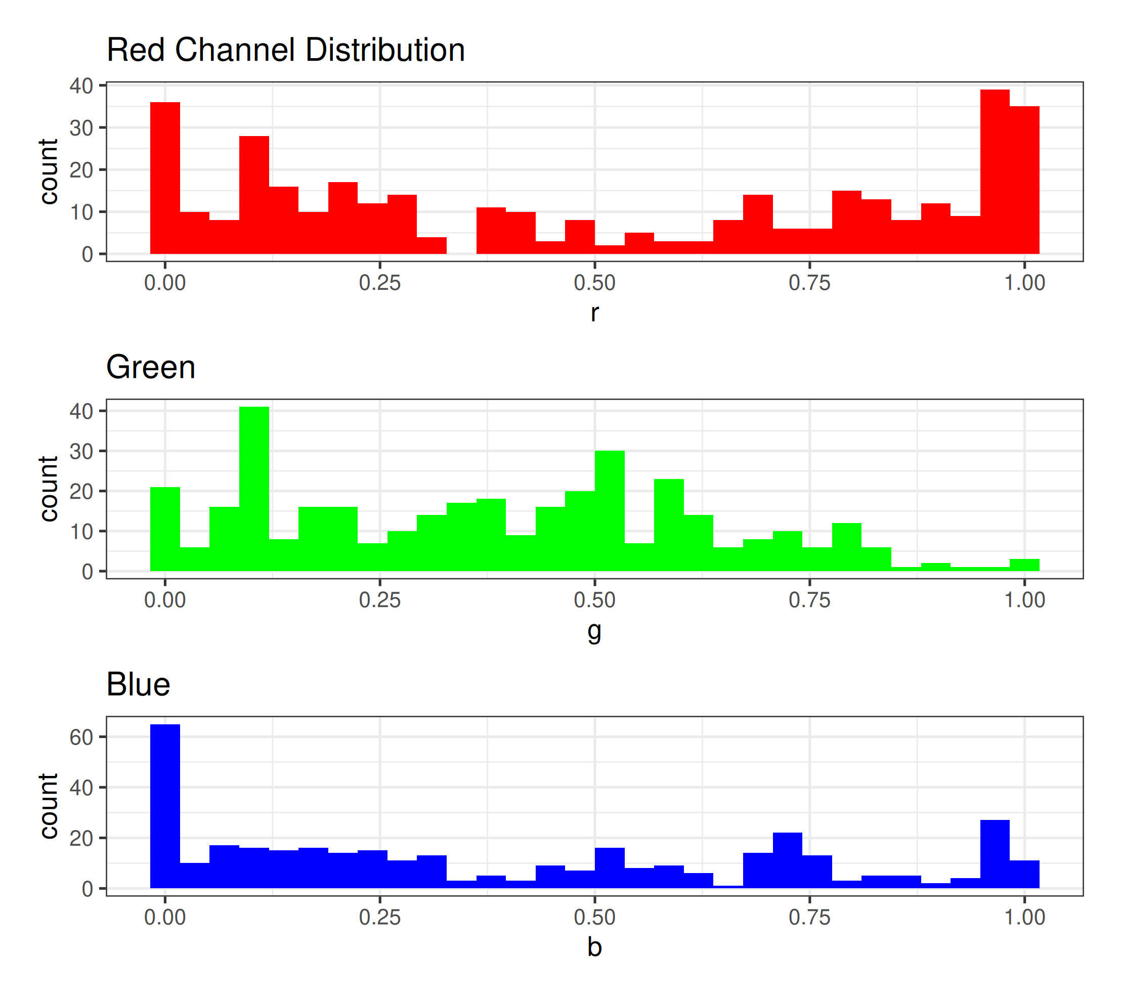
Small-multiples for the 3 color channels, univariate histogram:
library(ggplot2)
library(patchwork)

# Function to create color channel histogram
create_channel_histogram <- function(data, channel, color, title) {
  ggplot(data, aes(x = .data[[channel]], weight = N)) +
    geom_histogram(fill = color) +
    labs(title = title) +
    theme_bw(base_size = 40)
}

# Create histograms for each channel
channel_plots <- list(
  r = create_channel_histogram(colors_df, "r", "red", "Red Channel Distribution"),
  g = create_channel_histogram(colors_df, "g", "green", "Green"),
  b = create_channel_histogram(colors_df, "b", "blue", "Blue")
)

# Combine histograms using patchwork
combined_histogram <- channel_plots$r / channel_plots$g / channel_plots$b

combined_histogram
The distribution of each color channel, considered separately, showing the U-curve of Red and Blue (but general indifference to Green).
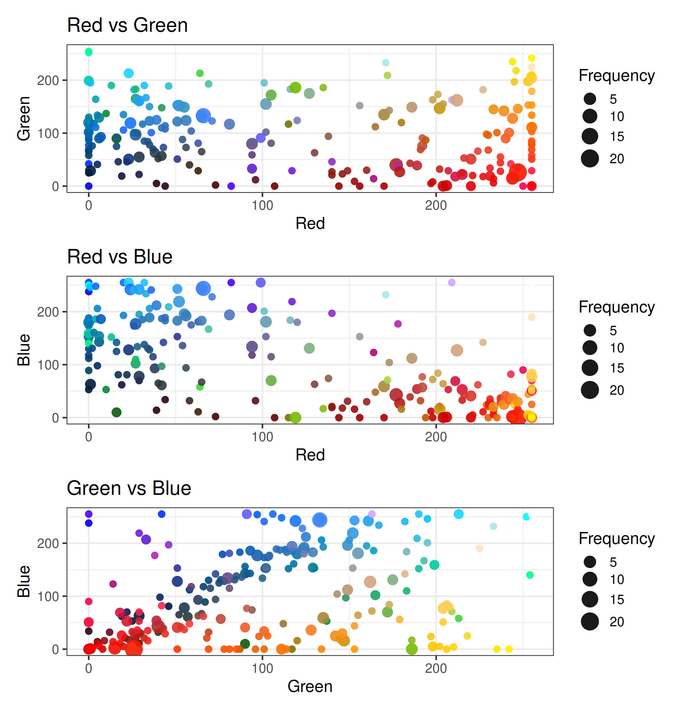
Graphing the Red vs Green vs Blue color distributions against each other:
## Graph R vs G vs B separately
create_color_comparison <- function(data, x_channel, y_channel, x_label, y_label) {
  ggplot(data, aes(x = .data[[x_channel]], y = .data[[y_channel]], size = N, color = RGB)) +
    geom_point(alpha = 0.9) +
    scale_color_identity() +
    scale_size_continuous(range = c(8, 20)) +
    scale_x_continuous(limits = c(0, 255)) +
    scale_y_continuous(limits = c(0, 255)) +
    labs(
      title = paste(x_label, "vs", y_label),
      x = x_label,
      y = y_label,
      size = "Frequency"
    ) +
    theme_bw(base_size = 40)
}

# Create all color comparison plots
comparison_plots <- list(
  rg = create_color_comparison(colors_df, "r", "g", "Red", "Green"),
  rb = create_color_comparison(colors_df, "r", "b", "Red", "Blue"),
  gb = create_color_comparison(colors_df, "g", "b", "Green", "Blue")
)

# Arrange comparison plots in a 3x1 grid
grid.arrange(
  comparison_plots$rg,
  comparison_plots$rb,
  comparison_plots$gb,
  ncol = 1
)
Graphing all colors, red vs green vs blue, in 3 plots.
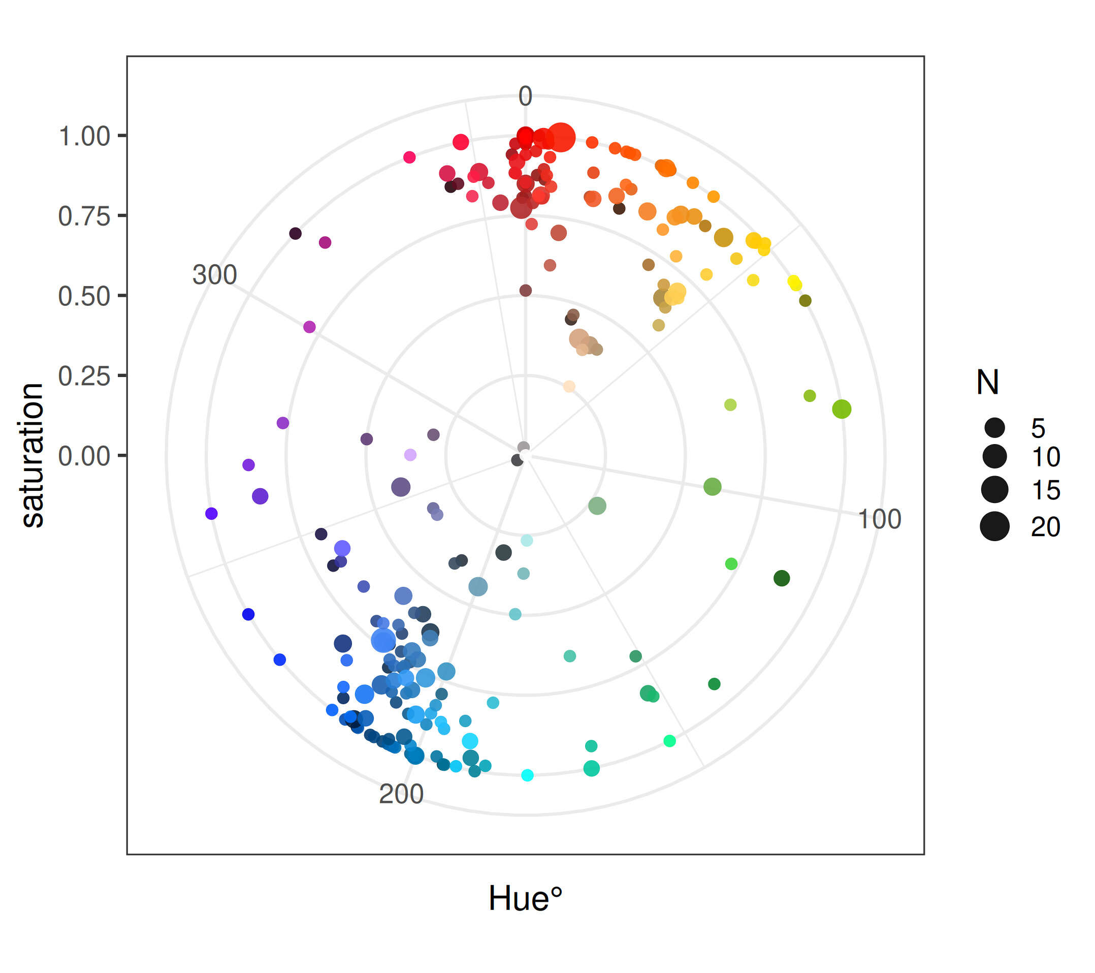
Color wheel representation:
## ensure RGB values are in 0--1 scale:
colors_df <- colors_df %>%
  mutate(
    r = r/255,
    g = g/255,
    b = b/255)

## Create matrix for `rgb2hsv` (note the different matrix structure)
rgb_matrix <- matrix(c(colors_df$r, colors_df$g, colors_df$b), ncol=3, byrow=FALSE)
hsv_matrix <- rgb2hsv(t(rgb_matrix))

## Now add HSV columns
colors_df <- colors_df %>%
  mutate(
    hue = hsv_matrix[1,],
    saturation = hsv_matrix[2,],
    value = hsv_matrix[3,])

## Plot on polar coordinates
library(ggplot2)
ggplot(colors_df, aes(x = hue * 360, y = saturation, size = N, color = RGB)) +
  geom_point(alpha=0.9) +
  scale_size_continuous(range = c(8, 20)) +
  coord_polar() +
  scale_color_identity() +
  theme_bw(base_size=50) +
  labs(x = "Hue°")
Plotted around a color wheel.
3D volume scatterplot, using rgl for interactive 3D visualization:
library(rgl)

par3d(family = "sans", cex = 4) # quadruple text size as unreadably small
plot3d(colors_df$r, colors_df$g, colors_df$b,
       col = colors_df$RGB,
       size = colors_df$N/2,
       xlab = "Red", ylab = "Green", zlab = "Blue",
       type = "s",  # spheres
       alpha = 0.7)
3 example rotations of the dataset as a 3D scatterplot, showing the emptiness of parts of the cube.
Underused: Yellow?
You laugh at the conformists, scoff at those who think they are different. Go for pink or purple and wear it like you own it.
Stuart Hall
Overall, the visualizations line up with my subjective impressions: red > blue > green > purple > yellow–brown.
This turns out to line up with the results of Stuart Hall in 2015 & which he replicated with relatively little change 7 years later in 2022, which I was unaware of; he did a much more thorough job by using the icon corpus from Appbot (a service for analyzing smartphone apps) and an automated “dominant color” metric (rather than my informal approach of picking the color that struck me as most representative or distinctive). Because he automated his analysis, he could take it further and analyze white/black icons as well.
The main noticeable difference for me is that he’s able to find some more yellow icons—eg. Snapchat, a major social network, but omitted from my link-icon colors because when would I ever link Snapchat? (“Snaps” disappearing and not being linkable is sort of the entire point of Snapchat…) He also has enough data to note omissions like “There’s a real wasteland in pink for paid apps” (unsurprising) and “Green is more popular on iOS [Apple] than Google Play [Android].” (Why?)
It may be worthwhile exploring more purple or yellow-heavy designs. While purple remains a tricky color to work with, due to its extremely strong connotations of royalty, gay men, small girls (eg. My Little Pony), or all 3 (Catholicism), yellow–brown seems more versatile.
Possibly yellow has been underused for a long time because computer monitors were not up to subtler colors and we suffered under the tyranny of “web-safe colors” (oh no, not the bees! ahh!) and decreasing experience with earlier technologies.6 But now that bright high-resolution displays are common on both desktop & smartphones (sometimes with larger color spaces), and we have many fancy technologies like textures and vector graphics, a yellow palette may be more viable.
-
In keeping with Saul Bass’s 1969 discussion of stripes: stripes just look fast, modern, and cool, so it’s hard to go too wrong with stripes.↩︎
-
I recommend using Firefox’s dev tools for this, because the Chromium color picker has strange UX limitations, like not being usable at all on websites with table-based layouts—it just doesn’t show up anywhere in the UI, while the Firefox dev tools color picker is always available.
Afterwards, I learned that my MATE GUI desktop environment provides
mate-color-selectwhich seems like it’d work as well. Mac OS users can use “Digital Color Meter” (default install).↩︎ -
Purple-black definitely has certain connotations of “Rust hacker”, if you know what I mean.↩︎
-
The lines, however, cause many surprising color perception problems of their own.
Due to the thinness of the link underlines & smallness of the link icons, a pale or dark color, which was clear when used in a large logo or in large site design elements such as buttons, may vanish or just look like black, so they need lightness adjustments, perhaps using a better colorspace than RGB like LAB. (We used YCoCg but switched to okLCH.) We also find it useful to ‘squeeze’ colors to set minimum/maximum lightness and increase chroma to make the color visible, and try to avoid too much overlap and ‘de-cluster’ the resulting colors; there is an interactive demo of the colorization.
Other challenges include the need for alternate SVG icons for cases where a single color is inadequate (which color is Microsoft?) and supporting the common case of “white-letter-on-colored-background”, which would be unreasonably burdensome to solve by manually creating SVGs one by one.↩︎
-
Obviously, I am making no claims about the Internet in general—the color trends could be entirely different elsewhere on the Anglophone Internet, never mind the Chinese Internet etc. I am simply interested in the distribution of colors across the websites I tend to read.↩︎
-
One notes, for example, the absence of amber or yellow colors from many cyberpunk or synthwave media ostensibly inspired by the 1980s. But actual 1980s design, like car dashboards (eg. Subaru XT Turbo), used the red–yellow range extensively—and little purple or pink!↩︎